Accessible Ticketing Experience
Year
2026
Type of work
UI/UX Design
Client
Theatre Dechaines
Softwares
Figma, Visual Studio Code
About the project
Théâtre Déchaînés is an independent Montreal theatre whose mission is to make the performing arts open and welcoming to everyone. Their website is where audiences discover artists, sign up for their newsletter, and buy tickets online. As part of DART 484: UX Design, we partnered with them to redesign their ticketing experience. Our main contact was Pierre Tremblay-Thériault, their Web and Accessible Communications Manager, who helped us understand the organization's needs and limitations throughout the project. The theatre also has an accessibility intern, a web specialist, and works with accessibility consultant Marie Ayotte, showing that accessibility is a core part of how they operate, not just a design goal.
Objective
This project explores how to design a more accessible online ticketing experience for Théâtre Déchaînés.
Right now, the site is not accessible enough, which means they need a full redesign focused on web accessibility and eco-responsible web practices, backed by research. They have internal support (an intern specialist and an accessibility intern) and will also be accompanied by people such as Marie Ayotte, but the current limitations are affecting real opportunities because they cannot reliably sell tickets online, they are restricted in collaborating with bigger theatres, even though they are already working in that ecosystem.
Creative Process + Challenge
Design process
Our process was research-driven and built around continuous improvement. We started by looking at the existing ticketing experience and identifying where users were being left out. Rather than treating WCAG 2.1 and 2.2 accessibility standards as a checklist, we used them as a guide for every design decision, organized around four principles: Perceivable, Operable, Understandable, and Robust.
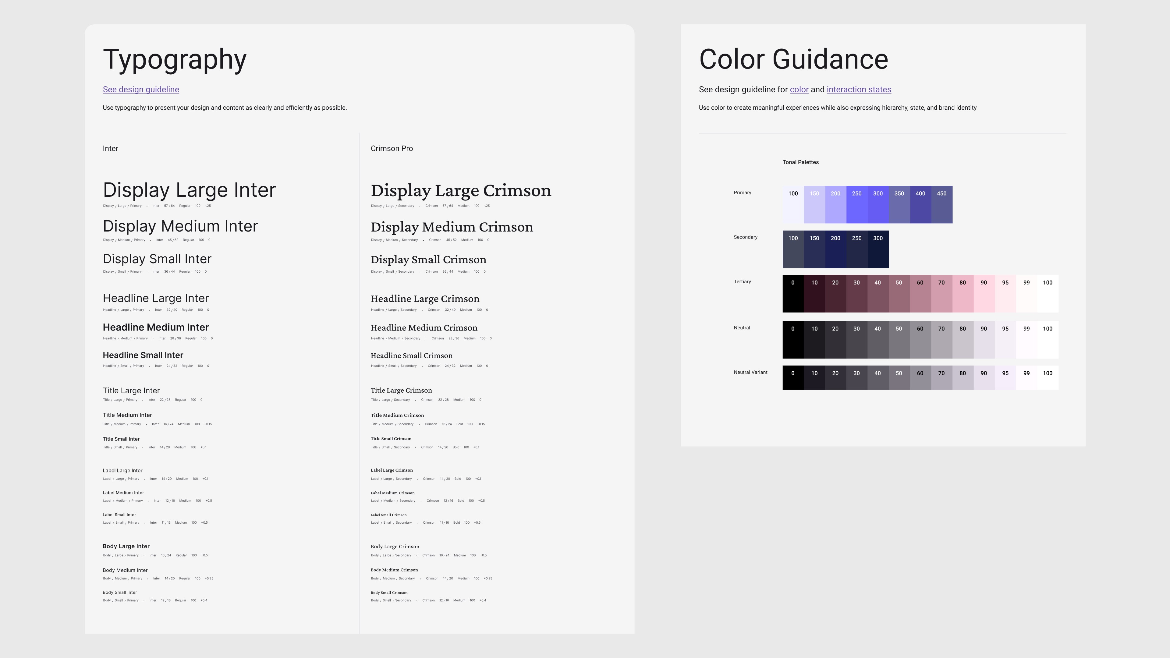
We met with our client weekly, which gave us a regular opportunity to share progress, get feedback, and adjust our direction. Early on, we built a design system to keep everything consistent — this included choosing two typefaces (Inter for clean readability, Crimson Pro for a warmer feel), a color palette tested for accessibility contrast, and clear text size guidelines. Having this foundation in place allowed us to move faster and more confidently through the rest of the project.
From there, we created interactive prototypes of the full ticketing flow, from browsing events to selecting seats to confirming a purchase. These were built using clean, semantic HTML to make sure the design would work well with screen readers and other assistive technologies over time.
Iterations and decisions
One of the biggest shifts in our process happened when we realized, together with our client, that the project was larger than what we could fully complete within the course. Instead of doing a little bit of everything poorly, we chose to focus on what mattered most: the core ticketing flow. Making that decision together with Théâtre Déchaînés was an important lesson in what honest, realistic design collaboration looks like.
Within the prototype, we made several specific improvements based on our research. We fixed keyboard traps in the date picker and ticket quantity tools so users could navigate freely. We reorganized the layout so that pricing and accessibility options like wheelchair seating appeared earlier in the process, avoiding surprises at checkout. Error messages were rewritten to be clear and direct. Focus indicators, the visual cues that show where you are on a page when using a keyboard, were made visible and consistent throughout. Every change we made was tied back to a specific barrier we had identified during our research.
Client feedback and evaluation
Our client responded positively to our work. Pierre Tremblay-Thériault noted that we understood their needs, listened to their requests, and stayed engaged throughout the project, including during the harder conversations about scope and priorities. What went well was our ability to respond to feedback quickly and turn accessibility principles into real, concrete design decisions. The weekly meetings helped build a steady working relationship where open communication felt natural.
The main challenge was the gap between a Figma prototype and a fully built website on Concrete CMS. Our final deliverable was a prototype, not a live system, and both we and our client understood that the actual implementation would go beyond the scope of the course. That said, the choices we made together about what to focus on meant that what we did deliver was thoughtful and genuinely useful, rather than a rushed attempt to cover everything.
Result
After months of research, iteration, and collaboration with Théâtre Déchaînés, we arrived at a ticketing experience designed from the ground up with accessibility and simplicity at its core. Our final prototypes reflect everything we uncovered — a clean, semantic, and lightweight system that empowers every user to independently browse, select, and purchase tickets, regardless of their ability or device.